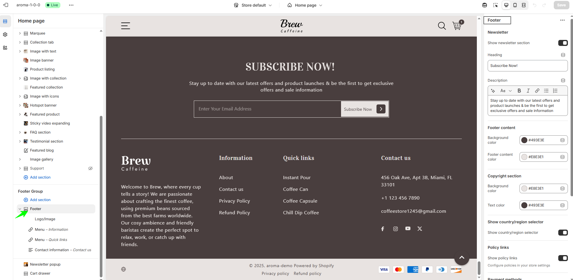
Footer Setting
The footer is the bottom section of your Shopify store that appears consistently across all pages. It serves as a key area for secondary navigation, legal information, and trust-building elements. The footer contains the following settings:
- Settings include newsletter signup, display of policy links, payment icons, footer color customization, and more.
- Logo or image & description block setting with column width options.
- Menu & heading block setting with column width options.
- Contact information block setting with column width options.
Footer Group
The footer offers versatile customization options to enhance your store’s functionality and style. You can easily add a newsletter signup to engage your customers, customize colors to match your brand, and display accepted payment methods for trust and transparency. Include important policy links to keep customers informed, and enable a country or region selector to cater to international shoppers. Social media icons help connect your audience with your brand across platforms. Plus, the footer supports flexible blocks with customizable column widths (in percentages), allowing you to create a perfectly balanced and visually appealing layout.
F.A.Q.
Yes, you can change the colors of the footer through theme’s customization settings to match your store’s branding.
Yes, you can add social media icons to the footer to help customers connect with your brand. To do this, first add your social media links in the footer settings or the theme’s social settings. Once added, the icons will appear in the footer automatically.
Policy links are important pages like your Privacy Policy, Refund Policy, and Terms of Service that inform customers about your store’s rules and practices. Yes, you can add these policy links to your footer, making them easily accessible to visitors and helping build trust.